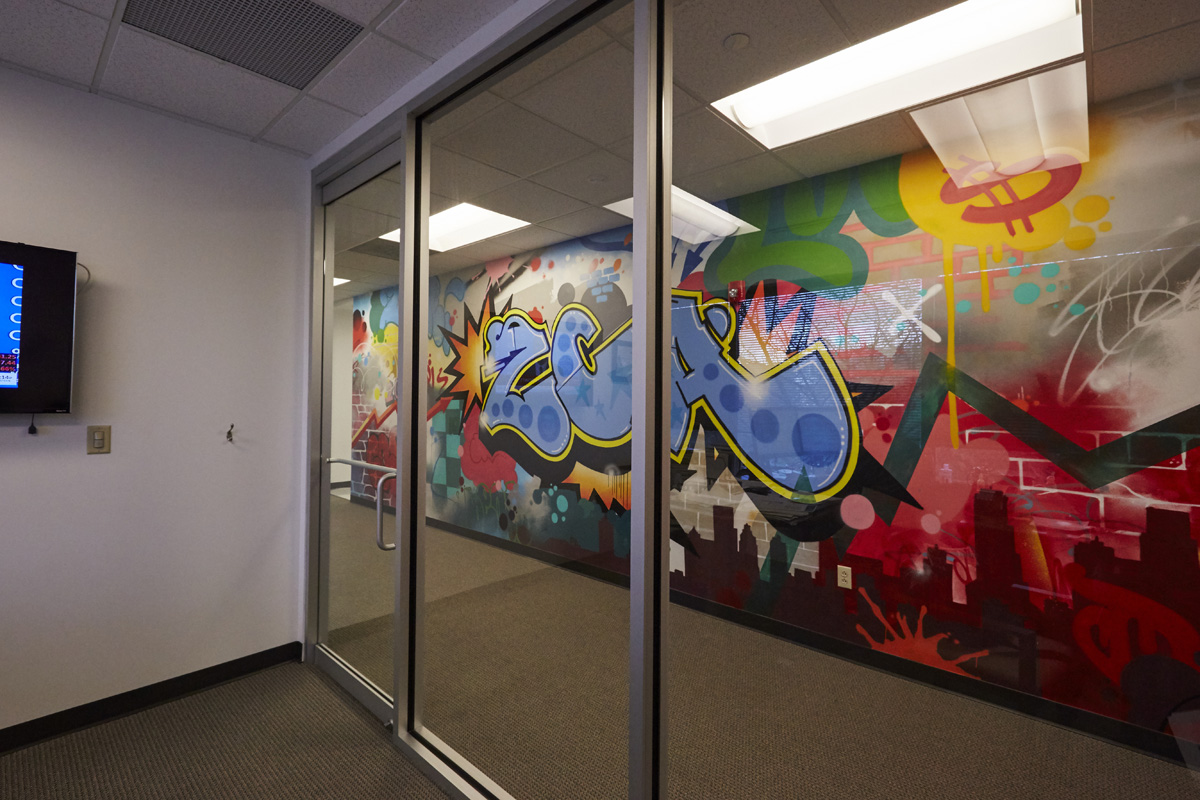
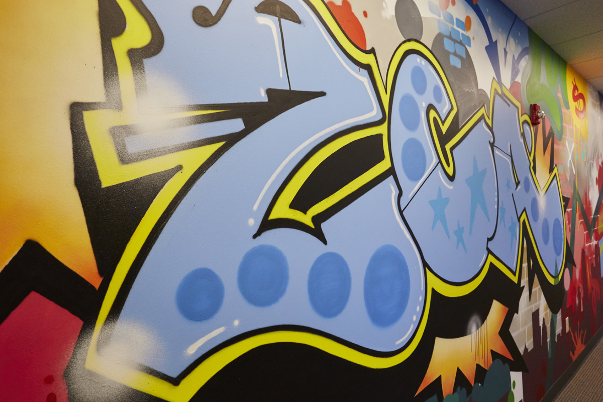
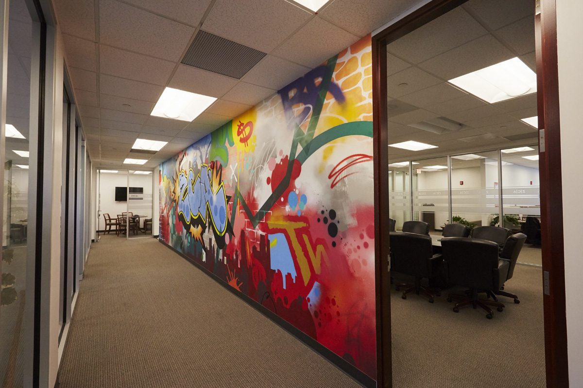
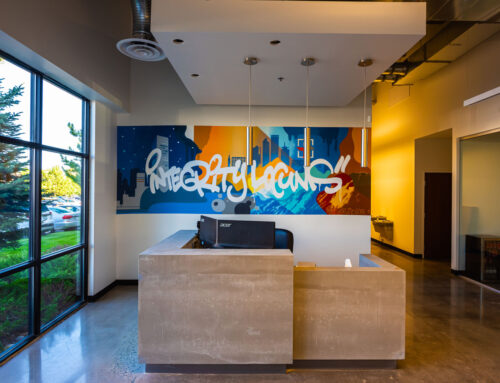
Bright graffiti mural. Zeke Capital, a company of investment advisors, asked us to create a mural for their space. After creative back and forth, we narrowed the aim of this piece: to make their central hallway look real-life edgy. A graffiti street look, something unexpected for a financial services business. The wall, now complete with bright colors and a variety of textured, layered spray-paint techniques like tags and throw-ups, screams against the surrounding white walls. The environment is mostly neutral at their office in Berwyn, PA. Hidden references to the company’s roots and the stock market were used, but intentionally illegible and subtle. “ZCA” graffiti letters are the mural’s focal point. Zeke sincerely loved the outcome!
The graffiti install seen through the glass conference room doors.
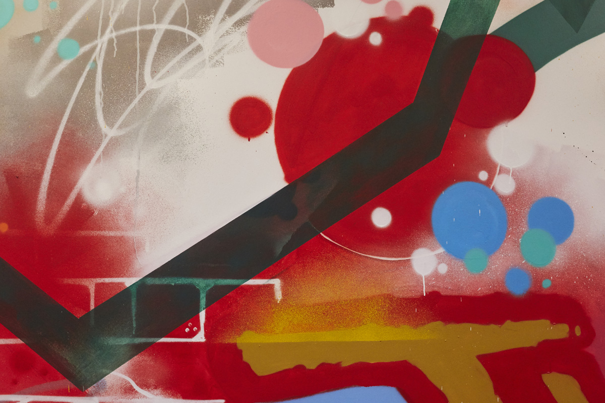
Detail shot of classic graffiti elements and a cool linear transparency.
The hero characters that spell ZCA in a close up angle shot above. Dots, stars and all of the graffiti details.
In the corridor you can see the city skyline, bricks and references, and also the overall graffiti collage reads.
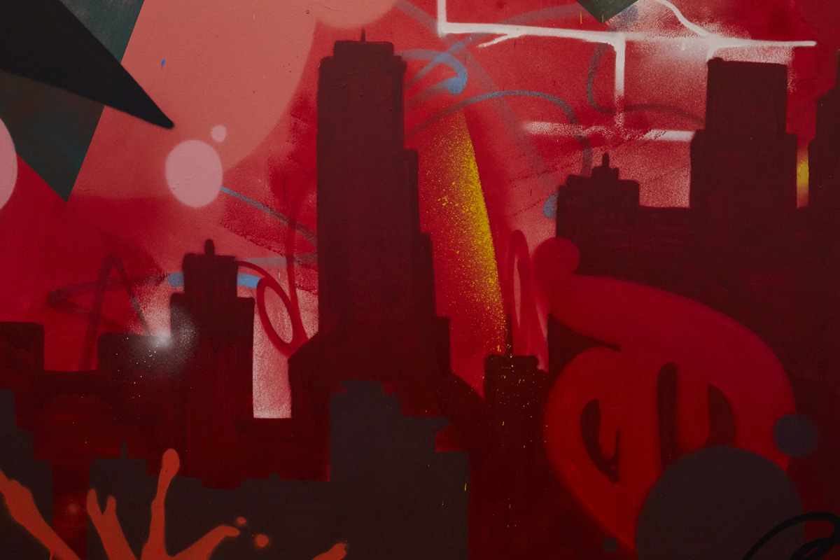
Detail shot of the red tone on tone skyline.
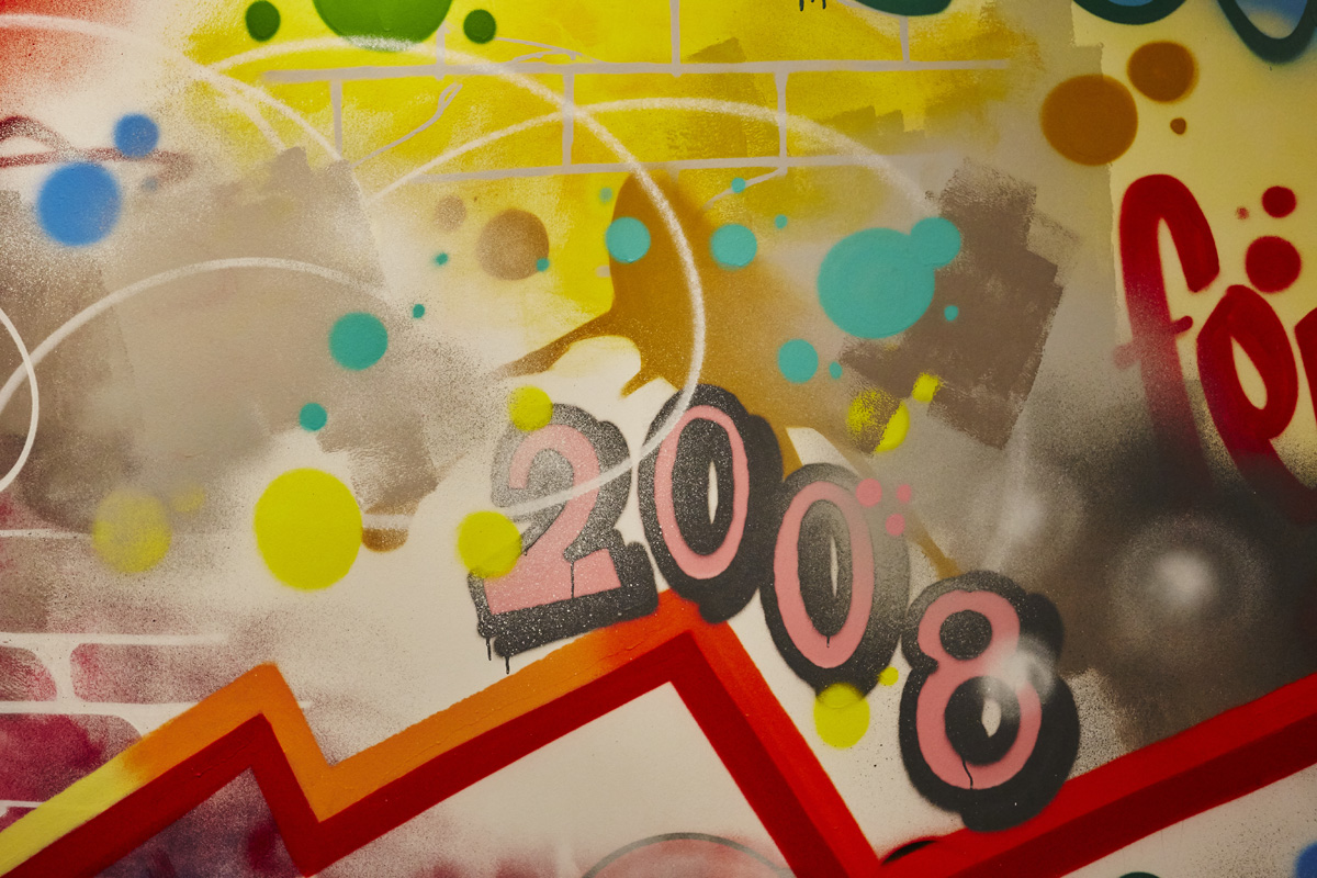
Yellow graffiti funk and the time stamp always present to let us know. 2008.
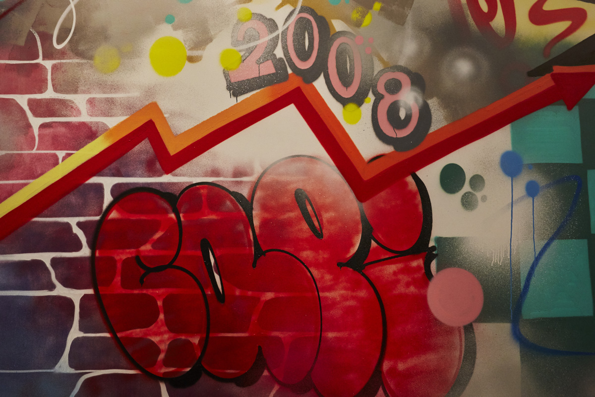
A little throwie on bricks for the win. Bright graffiti mural.

